What Does a Good Management Dashboard Show?
It's not about pretty graphs, but seeing absentees, delays, and costs in five minutes.
A good management dashboard doesn't require a separate report. Open it in the morning and know where the gaps are. It's not a presentation. Not a weekly Excel. It's a snapshot for this morning.
Attendance, overtime, missed rounds, open tasks: these reveal where intervention is needed today. If these aren't in one place, the manager makes calls. If they are, the manager decides.
What to See in Five Minutes
Not everything. Just what could go wrong today.
- Who hasn't clocked in, where there's a staff shortage
- Where shifts are delayed, where overtime is increasing
- Which rounds or checklists were missed
- Which tasks are open, where work has stopped
- Where money is lost: extra hours, replacements, repeated visits
If the dashboard only shows nice numbers, it's too late. A good view shows exceptions: what's not right.
Graphs Aren't Management
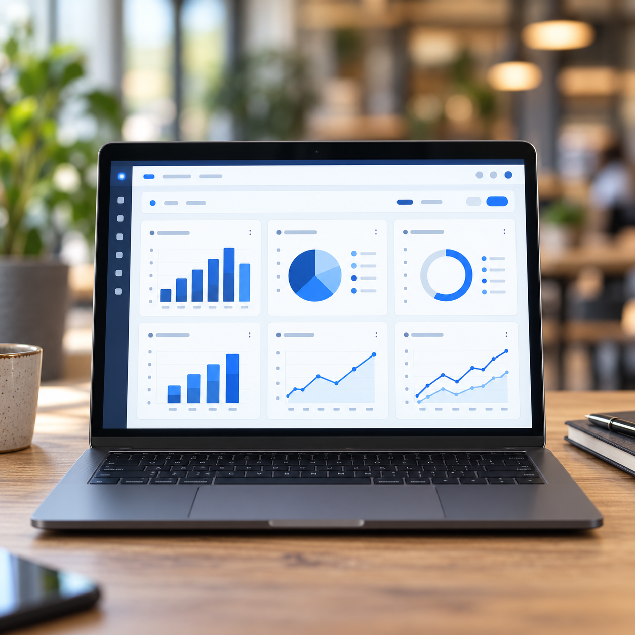
Pie charts look good in a demo. In the field, it matters that at 7:10 am, two people are missing from the third site, yesterday's closing list isn't done, and the open issue report has been standing since yesterday.
Costs don't first appear in annual reports. Overtime happened last night. Replacement this morning. If you only see this at month's end, you've already paid.
One View, Not Five Systems
Attendance is in chat, scheduling in Excel, tasks in phone notes, rounds on paper. Then the dashboard is just decoration. A manager trusts it when it's the same data recorded by staff on-site.
One screen in the morning. Not ten reports. Detailed reports remain for closing. For daily management, the gap is enough.
When a Dashboard is Bad
If you put everything on it. If it only has yesterday's data. If the numbers look good, but you can't click to see who's missing. If the manager has to ask separately, "send the latecomers."
A good dashboard is quiet. No need to ask. Open it, and you know where to call today and where not.